Solar Design Studio v2: one plan, two conversations
Solar Design Studio: v2 concept for a solar sales and planning tool
- Company
- EIGENSONNE
- Role
- Product Designer (v1) · concept by me
- Timeline
- v1 2023 · concept 2026
- Status
- v1 in active use · v2 unreleased concept
- Platform
- Web and tablet, inside the CRM
- Scope
- Product strategy, interaction model, UX, UI, design system
- Stack
- Figma, React, Salesforce, Storybook, Prototyping
Overview
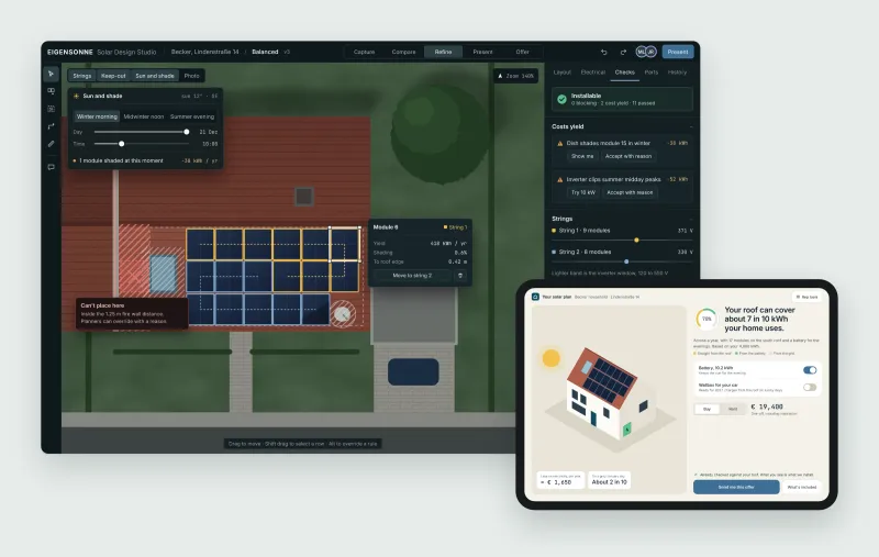
Sales reps and planners shared one tool but not one truth. Reps could sell layouts that planners later had to redraw, and customers watched someone operate software instead of seeing their own home. v2 treats the plan as the product: one plan, checked live against installation rules, shown through two surfaces, a dense workspace for planners and a calm, answer-first view for the customer. Error prevention moves to the moment of selling, and a rep can go from an address to a sendable, installable offer in one call.
Context
EIGENSONNE sold premium residential solar, mostly through video calls and home visits. Every sale depended on a design step: someone had to place panels on the customer's roof, choose an inverter and battery, and turn that into a price.
I designed the first Solar Design Studio in 2023, about two years after moving from front-end engineering into product design. It lived inside Salesforce, loaded straight from the customer record, and had a simple mode for customer calls and a full mode for planners. It worked: fewer planning errors, more calls converting, a shorter time to sale and better NPS.
Looking at it now, I can also see where it was an interface answer to a system problem. This concept is what I would design today.
What v1 got right, and where it fell short
v1 had good instincts. Loading from the CRM record removed retyping, two modes acknowledged two very different users, and the full-screen layout kept attention on the roof. Looking again:
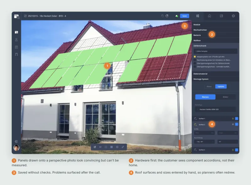
v1 with four annotations
- The photo was the hero, but not the truth. Panels drawn onto a facade photo looked convincing, but a perspective photo can't be measured. Planners often redrew layouts from scratch.
- Two modes, two tools. Simple and full mode were separate interfaces, so a change made in front of the customer didn't always survive into planning.
- Errors were found late. Setbacks, fire wall distances and string limits were checked after the call, when the customer already had a number in their head.
- Variations without a decision. We could generate several designs quickly, but nothing helped a rep compare them or explain why one was better.
- Interface over home. In customer mode the customer still looked at accordions of components rather than at their house and what it would do for them.
The job isn't drawing panels
The tool's real job is getting to a plan that is sellable and installable at the same time, ideally within one conversation. That changed the question from "how do we make drawing easier?" to "how do we make an uninstallable plan impossible to sell?"
Two people use the tool for very different reasons. The rep needs speed, confidence and a story. The planner needs precision and a record of every decision. Both work on the same plan, so the plan became the core of the product and every screen became a view of it.
Principles for v2
- One plan, many views. Planner workspace, customer view and offer all read and write the same plan. Nothing is copied between modes.
- Constraints are material. Installation rules shape what can be placed, live, instead of arriving as errors after the call.
- Show confidence. Anything detected automatically says how sure it is, and stays marked until a person confirms it.
- Answer first for the customer. Lead with what the system will do for this household. The hardware list is one tap away.
- Hand over, don't throw over. The offer leaves with everything planning needs, and says clearly what is still open.
Start from the address, not a blank roof
The customer record already holds the address, annual consumption and notes from the first contact. The studio opens on aerial imagery and an elevation model, detects roof planes with their pitch and orientation, and marks obstructions like chimneys and skylights. The rep keeps talking while it reads.
Every detection carries a confidence level. Anything below high becomes a small confirm task, settled on the call with a photo from the customer. The facade photo from v1 survives, but as evidence rather than as the drawing surface.
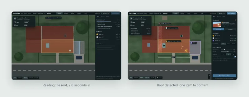
Reading the roof, then the roof detected with one item to confirm
Three options, each with a reason
Instead of a pile of generated variations, the studio proposes three options along one axis the customer understands: how independent do you want to be? Each is checked against every installation rule before it's shown.
The recommended option carries a short, rule-based reason built from what we already know: their consumption, a planned electric car, the limits of the roof. Underneath, one chart answers the question customers always ask next: what about winter?
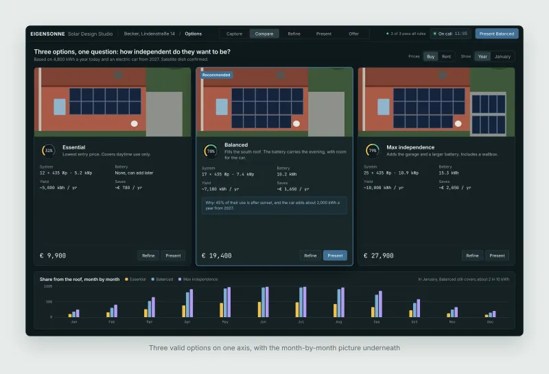
Three valid options on one axis, with the month-by-month picture underneath
A workspace that won't let you build the wrong thing
The planner surface is dense on purpose. Modules snap to valid zones only, and keep-out areas (roof edges, fire wall distance, the skylight) are drawn on the roof instead of listed in a dialog. Strings are coloured in place, so layout and electrical design become one activity.
A live checks panel separates what blocks installation from what only costs yield, and shows that cost in kWh per year. Shade is checked at the moments that matter, a winter morning or a summer evening, rather than played back like a timeline. Overrides are possible, but each one needs a reason and is flagged for review.
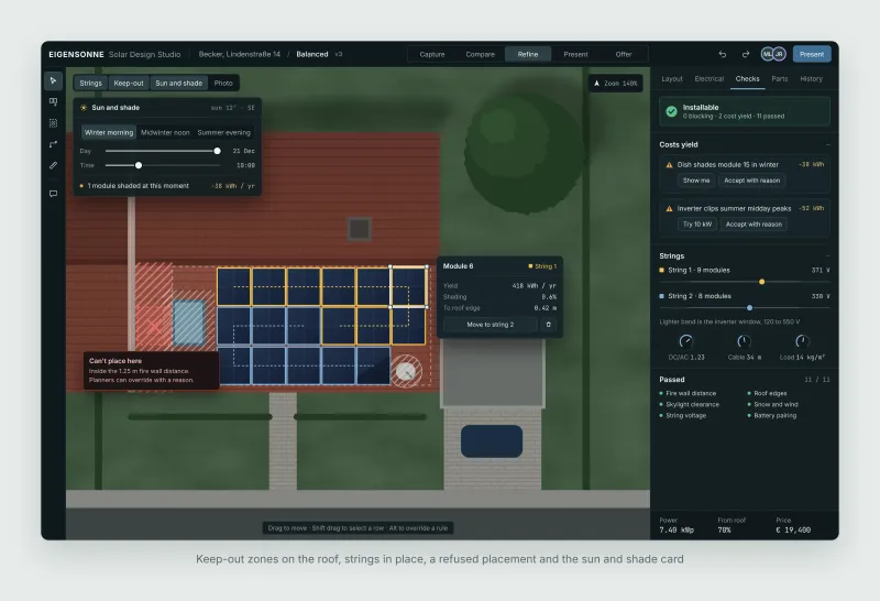
Keep-out zones, strings in place, a refused placement and the sun and shade card
The customer sees their home, not the tool
On a tablet at the kitchen table, or shared during a video call, the customer sees their own house with panels on it and one sentence that answers the question they actually have. The controls cover the decisions that matter to them: battery, wallbox, buy or rent.
Every change recalculates against the same rules, so nothing a rep shows in the room can turn into a redraw later. On a call, the rep can point at the house while the customer follows on their own screen.
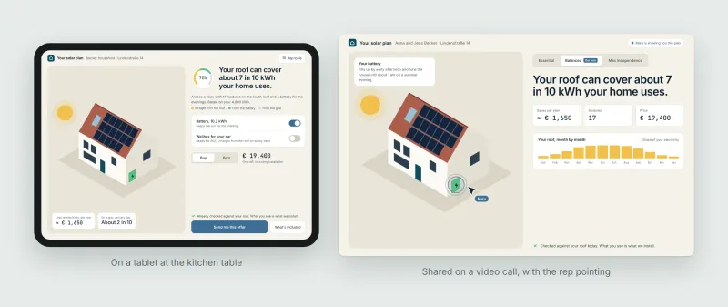
On a tablet for home visits, and shared on a video call
An offer that knows what is still open
Sending the offer writes the plan, the price and a readiness check back to the CRM opportunity. Open items are visible to everyone (a missing photo of the meter cabinet, an override waiting for review), so the planner starts from a clear picture rather than a phone call.
When the customer accepts, the handover completes on its own: a named planner, a provisional installation week and the grid registration submitted. The customer's confirmation repeats the same promise, and the rep has nothing left to chase.
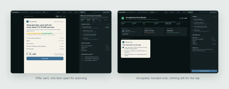
Offer sent with one item open, then accepted and handed over
Decisions and trade-offs
- Aerial first, photo second. Aerial data can be measured and is ready before the first call. Photos are better for details like the meter cabinet. Using each for what it does well removes most redrawing.
- Guardrails with an escape hatch. Hard limits for reps, overrides with a reason for planners. Locking everything down would have pushed edge cases back into spreadsheets.
- No free 3D editing. A 3D roof is impressive, but most of the value comes from correct measurements. The planner gets a top-down plan and the customer an illustrated house: cheaper to build and easier to trust.
- Three options, not ten. More choice slows a call down. Three options on one axis give the rep a clear recommendation and the customer a real choice.
The system behind it
- Quiet chrome, meaningful colour. The planner works in a dark graphite with a hint of petrol and a single steel-blue accent, so the roof and the energy colours carry the meaning: sun yellow for generation, green for battery, orange for cost and warnings, the same as EIGENAPP v2. Customer screens move to warm paper with the same accent.
- One brand, two sizes. The EIGENSONNE wordmark leads in the tool; the rounded house from EIGENAPP stands in wherever space is tight, so customers recognise it later in the app.
- Plan states as tokens. Detected, confirmed, override and blocked each have a colour, an icon and a text label, so meaning never depends on colour alone.
- Accessibility: real controls throughout, keyboard placement and nudging for modules, 44 px targets on the tablet view, and contrast checked in both themes.
How I would measure it
As an unreleased concept there are no results to report, so these are the measures I would set for a release:
- Share of sold plans changed by planners after the call, and by how much.
- Time from first call to sent offer, and offers sent during the first call.
- Close rate of calls that use the customer view against those that don't.
- Installation issues traced back to the design step.
Reflection
v1 taught me how much of a sale depends on one screen. Two years into product design, I solved for the interface: make drawing easy, make it look premium. Now I start from the system: what has to be true for a plan to be both sold and built, who needs to trust it, and where the errors come from. The screens follow from that.
All screens use fictional customer, product and price data.