Monitoring & Customer App
Mobile app for long-term customer relationships
Overview
Problem
After installation EIGENSONNE would usually say goodbye to the customer. How can they better establish an ongoing relationship with them? How can they offer more value to the customer.
Outcome
I designed an intuitive & enjoyable proprietary app. Providing energy monitoring, unique data breakdowns, weather and support. Building a component based modular design system, and providing additional feature designs for later feature releases.
UX Research
In our pursuit of creating a user-centric app, we conducted comprehensive competitor analysis and gathered insights through colleague interviews. These efforts were instrumental in identifying key factors crucial for enhancing user experience and maximising app utility.
Early in the development process, we delineated our differentiation strategy from competitors, specifically targeting a user base distinct from those catered to by existing advanced-level apps. Our approach centred on presenting essential data points in a user-friendly format, prioritising simplicity and accessibility.
Recognising the technical nature of our product, we placed a strong emphasis on fostering trust and confidence amongst users. To achieve this, we implemented robust systems health indicators, comprehensive FAQ sections, and intuitive energy flow interfaces.
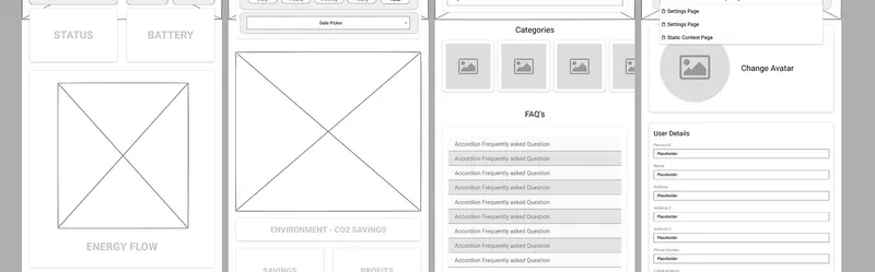
Top level wireframe pages
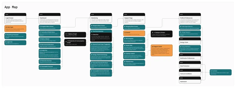
Application Map / User Flow
Design
Approach
Adhering to foundational principles in mobile design, I implemented thumb-sized, rounded, and responsive elements for all interactions within the app. By leveraging native iOS and Android interface elements and behaviours, such as swiping and drawers, instead of reinventing established patterns, we ensured an intuitive user experience.
Feedback from our early testers underscored the success of these design choices. They particularly appreciated the ability to quickly gauge their system's performance with a glance, emphasising the importance of easily accessible data for optimising their appliance usage.
Energy Flow
We employed variable speeds of animation within the energy flow diagram to represent the intensity of energy flows. This dynamic feature, coupled with straightforward breakdowns of production versus consumption, ensured that users could quickly grasp complex energy dynamics with just a glance.
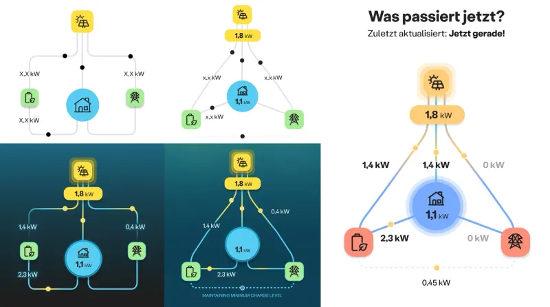
Early mockups to final energy flow diagram
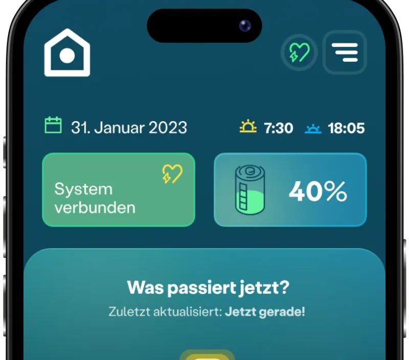
Dashboard prototype (alpha test)
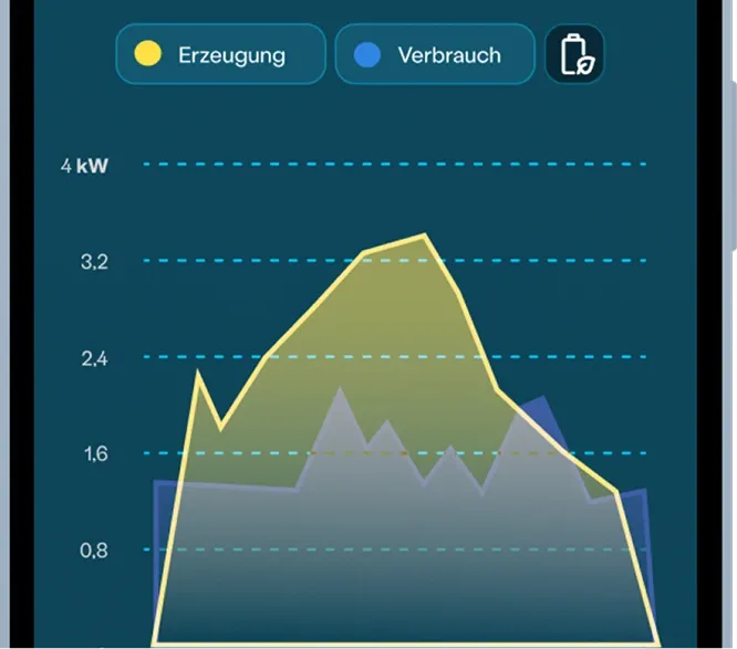
Daily graph prototype (beta test)
Colours
Our colour palette was meticulously chosen to optimise user experience. Following extensive research into colour psychology, we settled on a teal base due to its associations with calmness, serenity, and balance.
Results
Feedback from testers was overwhelmingly positive. Their enthusiasm and confidence in the app surpassed that of competitors' offerings and even the hardware manufacturer's own app. This project underscores the importance of early and frequent user engagement.