Portal, Web & Back Office
Three Enpal Energy surfaces, one design foundation
Overview
Alongside building the Enpal design family, I designed and prototyped across three of Enpal Energy's product surfaces: the customer portal, the consumer marketing web, and Hyperion, the internal back office. All three sit on the family's systems, so most of the work wasn't starting from scratch. It was composing one shared foundation into three fairly different contexts.
related · Enpal Design Family →One foundation, three contexts
The three surfaces sit at very different points on the same spectrum: a first-time visitor deciding whether to switch, a returning customer managing their energy, and an operations team working through hundreds of accounts. Build them separately and they drift apart. Build them on one system and they stay coherent, and they come together a lot faster.
The foundation is the Enpal design family: a shared parent layer (Enpal DS) with purpose-built sub-systems on top. VERSO handles consumer web, FOLIO handles dense product and internal UI. Colour, type, spacing and motion all come from one source, and each sub-system decides what those primitives mean in its own context. A handful of rules keep it honest. The big ones: brand yellow is reserved for conversion, ink leads in work contexts, and paper carries most of every screen.
Because the system ships as design tokens, a React/shadcn registry, an Ant Design theme and Figma variables, all generated from a single source, each surface below just pulls it in rather than rebuilding it. The full deep-dive on the system is a separate case.
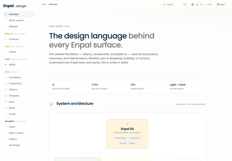
The shared foundation: Enpal.design docs (light)
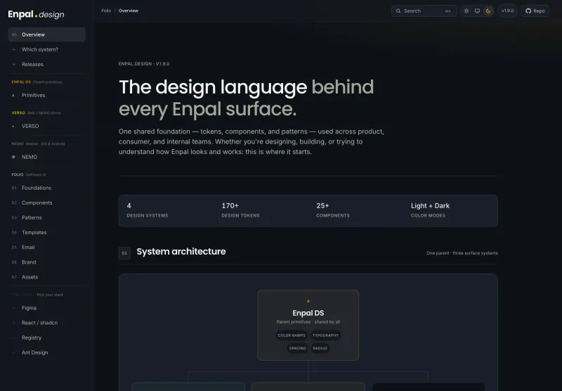
The same system, dark mode
Consumer web: the marketing site (VERSO)
The brief here was brand and tone: set a confident north star for Enpal Energy's consumer web, not win a conversion test. So I designed a landing page in the VERSO language, all expressive display type, a real-photo hero, pill buttons and borderless cards on a deep ink surface warmed by the family's aurora wash.
The tariff calculator is the one conversion moment on the page, so it's the thing that earns the reserved brand yellow, and everything else stays quiet around it. The trust signals (independent reviews, households served, certification) sit right under the headline.
It matters to the system because it proved the shared primitives could stretch from a calm product dashboard all the way to an expressive consumer page, without either one feeling like a different brand. The jump from landing page into the portal is a deliberate VERSO-to-FOLIO handoff.
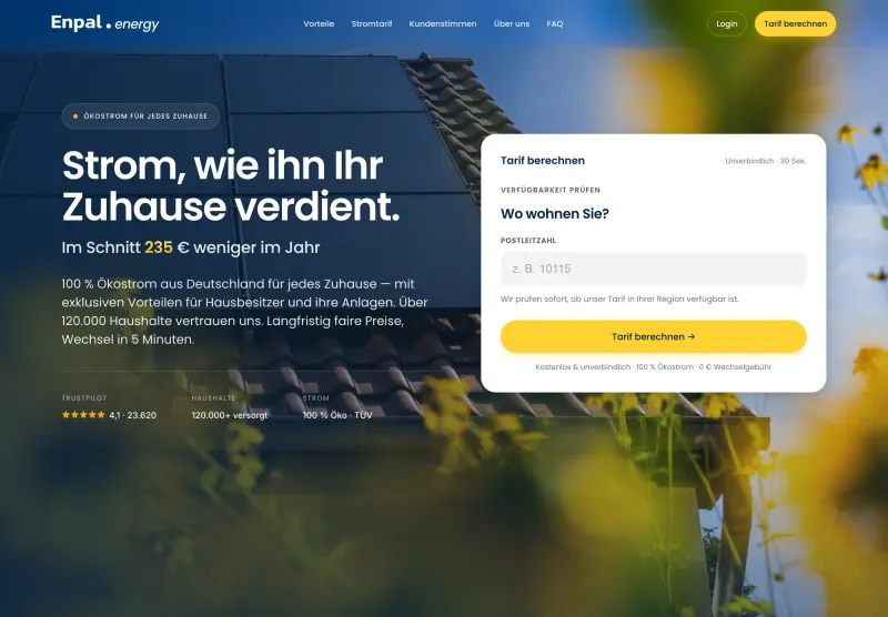
Consumer landing (VERSO): real-photo hero, with the tariff calculator as the one conversion moment
The customer portal (FOLIO)
The portal is where a customer manages their energy: consumption, meter readings (Zählerstand), tariff and billing. It's a returning-user surface, so it follows FOLIO's calm, dense conventions (ink primaries, status pills, one restrained upsell), in German, with full light and dark support.
The overview pulls together the next payment, the last meter reading, a live tariff timeline showing the cheaper and standard windows, and a savings breakdown against the local basic supplier. Contextual nudges, like a cheaper window tonight or a cold weekend ahead, only show up when they're actually useful.
I took it from a high-fidelity interactive prototype through to a production-ready TypeScript scaffold: React, Vite and React Router, consuming FOLIO as a shadcn registry with no vendored CSS, plus a typed API contract with mock fixtures. The idea was that backend and frontend could build the first version without having to re-argue routes, contracts or design-system bindings.
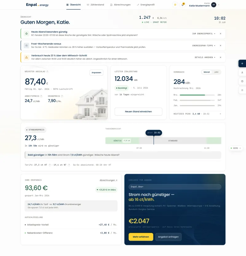
Customer portal overview (FOLIO), light
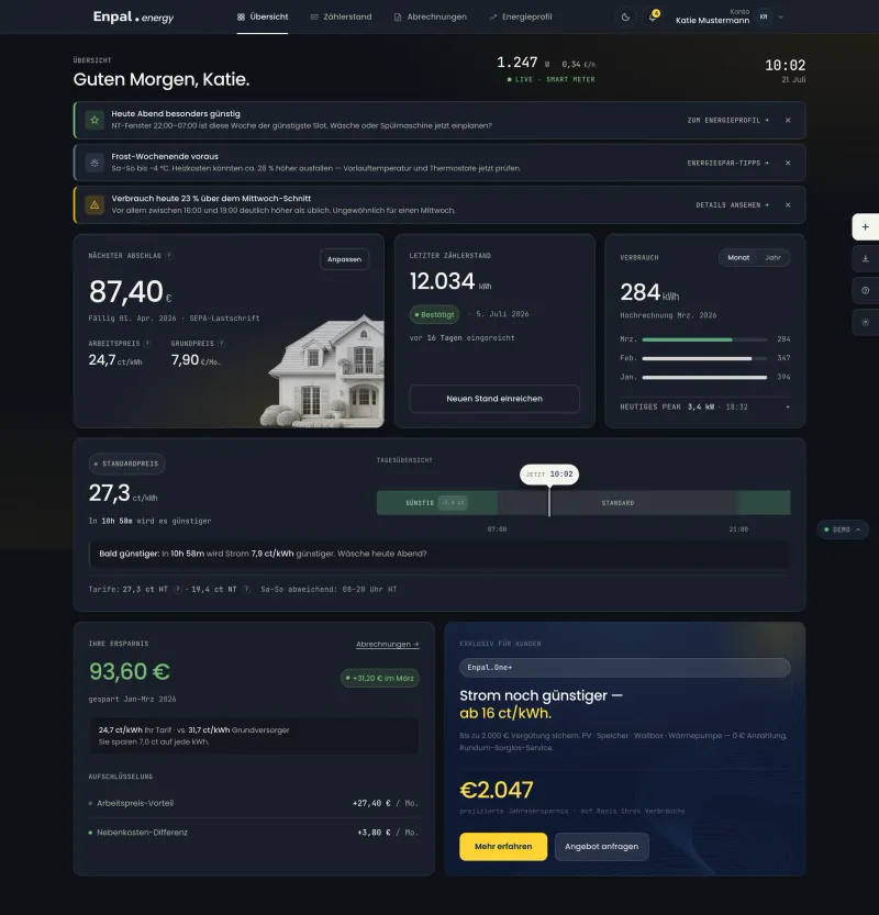
The same overview, dark mode
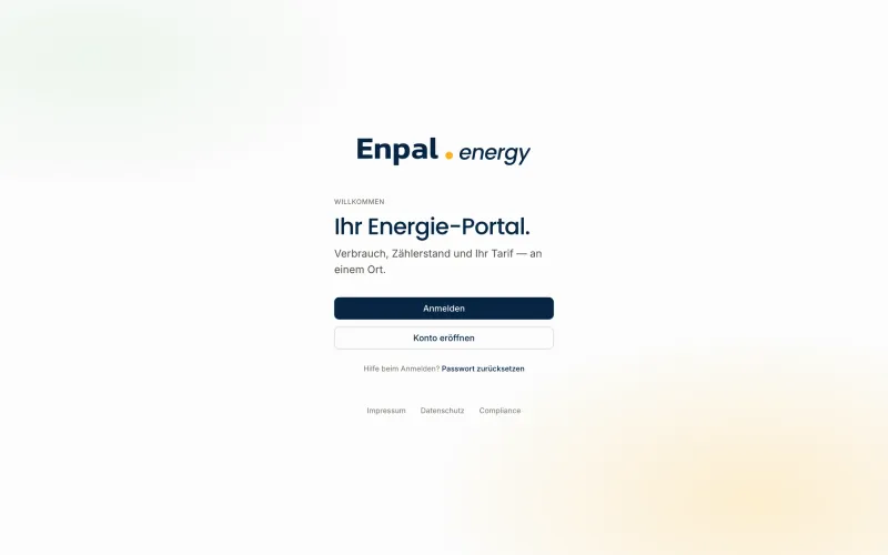
Sign-in from the production TypeScript build
The back office: Hyperion
Hyperion is the operational counterpart to the portal, a focused customer-360 tool for the teams who actually run the energy business. It uses the exact same FOLIO tokens and components as the portal, with a thin back-office layer on top, which is probably the clearest proof that the foundation carries all the way from a customer-facing product to dense internal software.
The customer view uses a products-as-context pattern: pick a product or contract on the left and the Registration, Contract, Payment and Communications tabs update on the right, right down to the regulated market identifiers (MaLo, MELO, DSO, TSO). Status pills are the shared language across customers, contracts and products, a two-tier navigation keeps top-level taxonomy and per-section context apart, and a ⌘K command palette is the global launcher. Everything shown here runs on fictional fixture data.
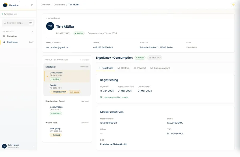
Hyperion: customer-360 detail (light)
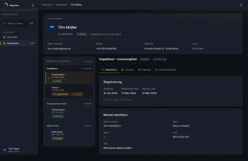
Customer-360 detail, dark mode
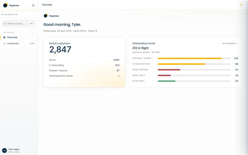
Operations dashboard: active customers and onboarding funnel
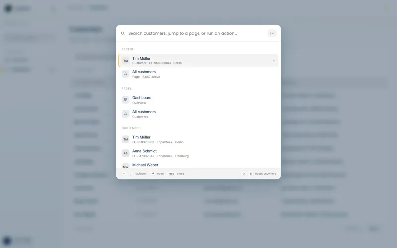
The ⌘K command palette: search, jump and run actions
Design-engineering craft
A few decisions that don't really show up in a screenshot but made the pace possible:
- Tokens are the single source of truth. The CSS, the shadcn registry, the Ant theme and the Figma variables are all generated from one token file, so a change propagates everywhere instead of forking.
- Products consume the system, they don't copy it: a shadcn registry or a single stylesheet link, nothing vendored.
- Theming with no flash. A shared storage key and a pre-paint script set the theme before the CSS parses, and the View Transitions API handles the cross-fade. Light and dark are equal citizens.
- Prototype to typed scaffold as a deliberate handoff: a single-file interactive demo to agree on the feel, then a strict-TypeScript scaffold that locks down routes, contracts and design-system bindings.
- Governance as design: adoption is informed or requested, never forced, with a written propagation order from system to portal to web.
Where it stands
One foundation now carries three surfaces: a consumer landing page, a customer portal (a prototype plus a production-ready TypeScript scaffold), and an internal customer-360 tool, all speaking the same visual language, in light and dark.
All three are now in use at Enpal. The story here is the design and the leverage the system gives rather than headline metrics. The full system deep-dive lives in the Enpal Design Family case.